
PlutoPay - A responsive web app that acts as a virtual credit card wallet and transactional card for payments and transfers.

The Project.
Why.
The world of buying and selling has changed - more and more transactions are taking place online or contactless. People needs a way to shop, transfer money, and more without a use of various debit or credit cards.
What.
I designed a web app that gives an all-in-one solution for credit and debit cards. Pay securely and contactless in a store, on a website or in an app with your personal, digital PlutoPay card and always have an overview of your purchases and expenses.
How.
Along the design process I developed a mobile high fidelity prototype after several user analyses and design iterations. I completed the project within 6 months in addition to my job as a product owner.
The Process.
During the project it was important to me to follow a user-centered design process that puts the user with his goals and needs in the foreground.
1. Discover.
2. Define.
3. Design.
4. Test.
Discover.
Benchmark
To get an insight into the industry, I naturally looked at what the competition is up to in terms of usability, navigation, layout & compatibility.
Besides the online payment solutions PayPal & Apple Pay, the provider Curve is one of the main competitors. Curve offers a wallet function and is also a payment solution. While Curve focuses on cashback and loyalty programs, PlutoPay is to expand the monitoring of finances in addition to the wallet and payment solution with the goal of analyzing and optimizing its monthly income and expenses.
Survey
Through the survey with a total of 20 participants, I first learned who my users are and what they think about online banking and financial apps. These are the key insights of the survey.
To shop online most users (94.4%) use PayPal as payment method.
About half of the respondents say that paying via smartphone makes paying easier (61%). They stated that their smartphone is almost always with them.
Approx. 28 % even think that paying with a smartphone is more hygienic in times of pandemic, as they can pay contactless without using cash or card readers.
61 % find it important to have an overview of their finances and only 11% expect coupons / discounts for using a mobile payment.
Interviews
In the user interviews, it was important for me to listen carefully to my potential PlutoPay users to understand what they want. They brought the following facts and insights to the surface.
Virtual Wallet. People no longer need physical credit or debit cards. They need an option to store them virtually in their smartphones so that they are always at hand.
All In One Solution. People want one simple payment solution instead of thousands of credit cards in their wallet or banking or payment apps on their smartphone.
Trust through transparency. All information has to be transparently visible and accessible, so that they can be sure they are in control of their data.
Financial monitoring. People expect a clear overview of all their transactions to track their behavior.
Real-Time Information. People expect real-time display and notifications of inputs - and outputs.
Shopping happens on the side. Money transactions are annoying and should therefore be done quickly -almost on the side.
Define.
Problem Statement
People needs a way to shop, transfer money, and more without a use of various debit, credit or giro cards because they want to have their payment account and balances in only one app and can pay with only one payment solution in a secure way.
We will know this to be true when we see how many users are registered to PlutoPay, link one card to their account and make one transaction per month with the virtual PlutoPay Card.

Persona for Tom
Personas
My personas help build empathy with PlutoPay's potential users and make decisions taking into account their needs and goals, as well as prioritize features towards an initial MVP.
User Journey Maps
Using user journey maps for my 3 personas, I visualized the processes a user goes through to reach a goal. The example below shows my perosna "Tom". His goal is to have his credit cards available in an account and know what he spent them on. This goal also represents the outcome for the MVP at the same time.

User Journey Map for Tom
Ideate.
Task Analyses
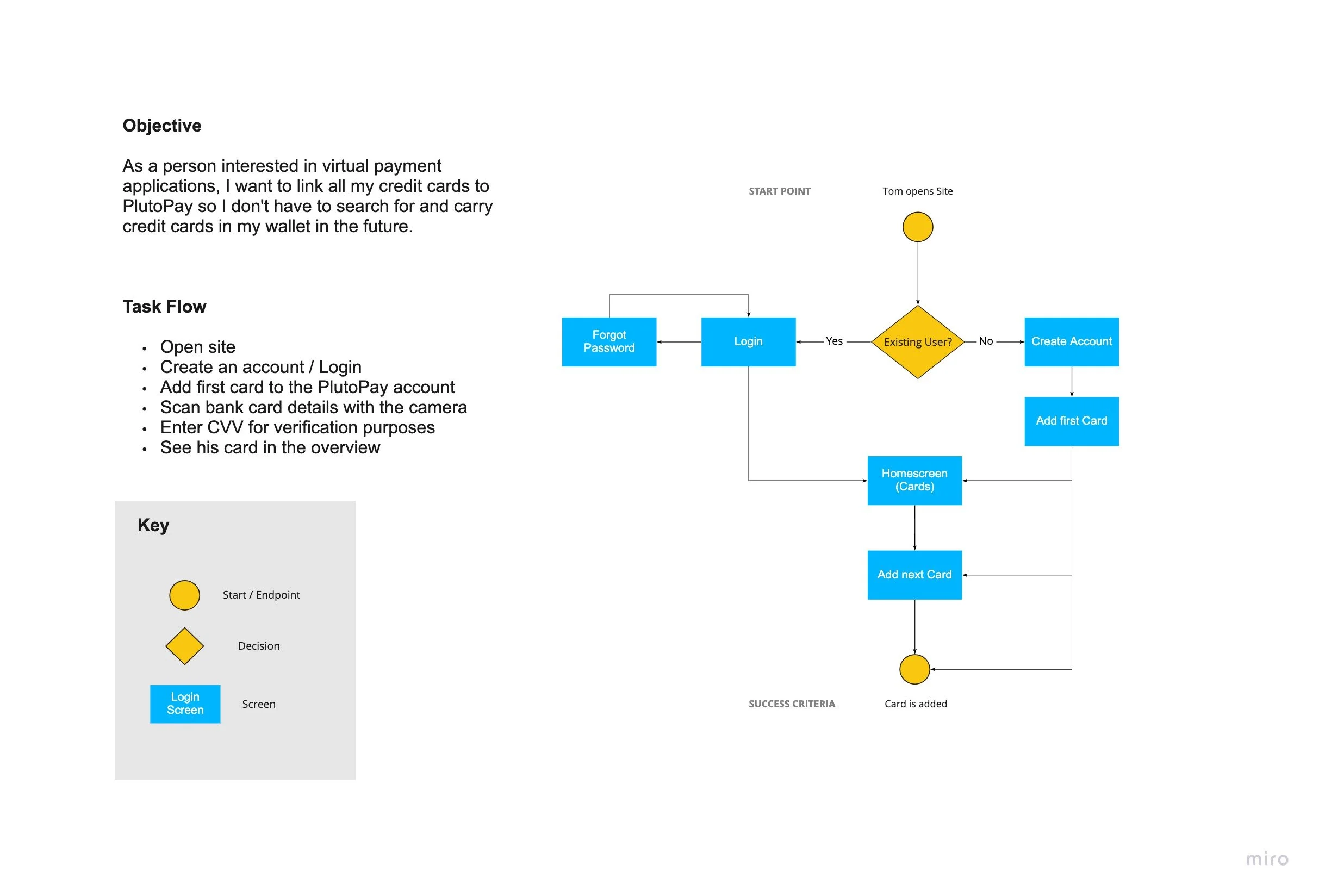
Through a task analysis, I determine exactly what tasks are required for my persona to achieve its goal. To begin the task analysis, I must first define a goal for the prioritized persona Tom:
“As a person interested in virtual payment applications, I want to link all my credit cards to PlutoPay so that I don't have to search for and carry credit cards in my wallet in the future.”
Task Flows
Now that I have created 3 personas and know what actions they will perform and why (user journey map), it is time to create user flows. For the MVP of my app, I will present Tom's user flow here.
I created user streams before the design phase to know which pages my web app needed. This is the only way I can stay focused and not get lost in designing the pages.
Task Analyses and Task Flow for Add a Card
Sitemap
Now it's time to think about the site structure and information hierarchy of PlutoPay (information architecture).
I have illustrated these structures with the help of the following sitemap. It is a kind of organizational map that outlines the hierarchy of the WebApp.
Card Sorting
After I created a first sitemap according to my mental model, it was important for me to involve potential users at this point. With the help of card sorting, together with feedback from my target group, I was able to find out at an early stage how to structure the information of my WebApp.
Sitemap before Card Sorting

Sitemap version 1
Sitemap after Card Sorting

Sitemap version 2
Design.
Low Fidelity Wireframes
Now that I've created a well-functioning sitemap, it's time to create paper prototypes for PlutoPay. These so-called low-fidelity prototypes are meant to highlight the high-level functionality of a design. They are quickly created so that I can put my first creative ideas on paper.
The focus of the low fidelity wireframes was how I arrange the navigation on mobile and desktop. I decided to use a bottom navigation for mobile. On desktop, I used the space on the side and placed the navigation on the side.

Low-Fidelity Wireframes for Mobile & Desktop - Cards
Mid Fidelity Wireframes
Next, I developed some mid-fidelity prototypes using Adobe XD, with a bit more detail than my paper sketches, as well as important interaction details.

Mid-Fidelity Wireframes Mobile $ Desktop - Cards
High-Fidelity Prototype
The next step is to test my wireframed on potential users. However, my mid-fidelity wireframes are not sufficient for this, as they do not reflect the interaction possibilities well enough. So I created a prototype with high-fidelity wireframes, so I can test them within a usability test and get user feedback. The prototype is clickable, but it only shows grayscale and important features of PlutoPay that the test subjects should use with the help of test scenarios.

High-Fidelity Prototype
Testing.
Usability Testing
With the help of a usability test, my 6 test users had to complete several tasks with my prototype. In addition, the test helped to identify critical errors. I was able to observe where the participants were confused or even made wrong decisions. However, I could also see that they enjoyed interacting with the prototype and did not take long to complete the tasks. Conducting a user test at this point was important, because I can incorporate the feedback and hints when I start visualizing the designs of PlutoPay.
Affinity Map
Now I've sorted and classified the survey results using an Affinity Map. Affinity mapping helped me structure all the quotes and observations into concise information and then group them so I could quickly identify patterns of behavior.

Affinity Map Usability Testing
After the mapping, the following key insights emerged, which I took into account in my further designs:
Users found the wallet function great, as they have all their credit cards in one place here
Users found it great that they can view their transactions per card and don't have to use different apps to do so
Users did not understand where to click to add a new credit card
Users found that the Home page is confusing due to many tiles and info
Users like the scan function to enter the card details by adding a new credit card
Preference Test
In the next step, I performed a preference test for the scan function. This feature was popular with my test users, however, I had observed that some recognized the icon late in my prototype. Therefore, I tested 2 screens against each other in an A/B test (preference test).
The test with 11 participants ran for about 24 hours with the Usability Hub tool. The winner was variant B with 91%.

Preference Test A vs. B (winner)
Iterate.
Design Refinement.
With feedback from my usability testing, it was time to bring my wireframes to life. I applied Gestalt psychology and visual design principles to my High Fidelity Wireframes and engage users using emotion while and after using PlutoPay. For example, by creating a positive first impression (visceral level), by making the web app easy to use (behavioral level) and by ensuring that PlutoPay remains in the user's memory for as long as possible (reflective level).

Design after Gestalt psychology & visual design principles
In the next iteration I compared my design to the Material Design guidelines and optimized components of the web app. The guideline recommendations helped me improve uncertainties in the design. So I was able to follow guidelines and get inspiration that Google & Co. also use, which gave me confidence for one of my first designs. For example I was able to optimize the input fields in such a way that they provide the user with all the information they need for input, but still don't look too cluttered. Also, the navigation now includes labels under the icons, and looks more restrained than before but still prominent enough to catch the user's eye.

Before & after optimization with Material Design (navigation & input fields)
Accessibility
To ensure the usability of PlutoPay for people with disabilities, I made further optimizations in the final iteration stage. For example, after a color analysis of font color and background, I made the onboarding screen more readable and enriched the input fields with icons and placeholders.

Before & after optimization with Accessibility guidelines (onboarding & input fields)
Design Language & Styleguide
Last but not least, that my designs can be more easily reused and standardized by others it is important that I create a style guide as well as a design language for PlutoPay. These documents also help me maintain the visual integrity of my design. They are a guide that informs those who work on the project after you about what to do and what not to do.

Final Product
Finally, after almost 6 months I had managed to design an MVP using analysis, testing and iteration stages. The design contains the core functions, such as registration, add card and wallet function. PlutoPay is also completely responsive and can be used on smartphone and desktop.

Retrospective.
Learnings.
„It’s all about the process.“
Ready through my experience as a product owner, I knew how important it is to listen to the users of a website. But I never knew an effective way how to analyze the user and how to target conclusions from their actions. In many projects, I made a lot of conclusions about user behavior in a very short term and not targeted or rather based on gut feeling. During the project I learned to always follow a process to better understand the user and make targeted decisions.
Improvement.
The prototype does not yet contain all design and needs to be extended and shows a small glimpse of the WebApp.
I personally want to get more familiar with the UX tool Figma. So far I have been working with Adobe XD, but I would like to broaden my horizons here to strengthen my skills in this area, especially because I enjoyed creating wireframes and the final prototype the most during the project.
Next Steps.
I would definitely like to extend the prototype with more functions. Furthermore, I am looking forward to the next usability test, which will be carried out with the help of the prototype.
The findings from this test will optimize the prototype again and prepare it for development.